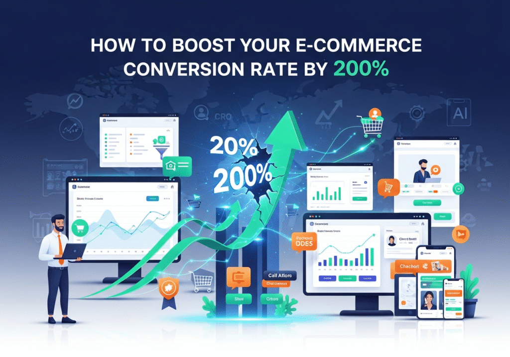
How to Boost Your E-Commerce Conversion Rate by 200%
You are spending money on Facebook ads. You are posting daily on Instagram. Your SEO strategy is finally bringing traffic to your website. But when you look at your analytics at the end of the month, the sales figures just don't match the traffic numbers.
This is the most common frustration for e-commerce business owners: High traffic, low sales.
In the industry, we call this a "Conversion Rate" problem. Your conversion rate is the percentage of visitors who actually make a purchase. If 100 people visit and only 1 buys, your conversion rate is 1%. The average global e-commerce conversion rate hovers between 2% and 3%.
If you can move that needle from 1% to 3%, you haven't just improved your business slightly—you have tripled your revenue without spending a single extra penny on advertising.
Boosting your conversion rate isn't about magic; it is about psychology, design, and removing friction. As a web development agency specializing in high-performance Shopify and WordPress sites, we have identified the specific changes that turn browsers into buyers. Here is how to boost your e-commerce conversion rate by up to 200%.
“We can easily manage if we will only take, each day, the burden appointed to it. But the load will be too heavy for us if we carry yesterday’s burden over again today, and then add the burden of the morrow before we are required to bear it factorial non.”
Rebert Kosta
1. Speed Kills (Or Saves) Your Sales
The first rule of conversion optimization is technical, not visual. If your site takes more than 3 seconds to load, 40% of users will leave before they even see your product.
In 2026, patience is at an all-time low. A slow website tells the customer two things:
- This company is unprofessional.
- This checkout process might be insecure or buggy.
 Your Sales")
The Fix:
- Optimize Images: High-resolution images are great, but if they aren't compressed, they clog your bandwidth. Use modern formats like WebP.
- Minimize Code: If you are on WordPress, clean up unnecessary plugins. If you are on Shopify, ensure your theme code isn't bloated.
- Use a CDN: A Content Delivery Network ensures your site loads fast whether the customer is in New York or Mumbai.
Pro Tip: Use Google PageSpeed Insights to check your score. If it's in the red, you are losing money every second.
2. Eliminate "Checkout Friction"
The checkout page is the graveyard of e-commerce sales. This is where "Cart Abandonment" happens. The number one reason users abandon their carts? Forced account creation.
If a customer is ready to give you money, do not put a wall in front of them by forcing them to create a password, verify their email, and fill out a profile.
The Fix:
- Enable Guest Checkout: Let them buy first and create an account later (on the "Thank You" page).
- Single-Page Checkout: Try to keep the entire process (shipping, billing, payment) on one page so the user can see the finish line.
- Show Progress Bars: If you must use multiple steps, show a progress bar (e.g., "Step 2 of 3") so they know how long it will take.
- Multiple Payment Options: Offer credit cards, PayPal, Apple Pay, Google Pay, and localized options (like UPI in India or BNPL services like Klarna/Afterpay).
3. High-Quality Visuals and Video
In a physical store, a customer can pick up a product, feel the fabric, check the weight, and inspect the stitching. Online, they only have your photos. If your photos are blurry, small, or limited to one angle, the customer’s brain signals "Risk."
The Fix:
- Zoom Functionality: Allow users to zoom in to see texture and details.
- 360-Degree Views: Let users rotate the product.
- Video Content: A 10-second video showing the product in use increases conversion rates massively. For fashion, show how the fabric moves. For tech, show the device being held to demonstrate scale.
- Lifestyle Shots: Don't just show the product on a white background; show it being used in real life to help the customer visualize ownership.
4. Build Trust with "Social Proof"
When we buy online, we are all looking for reassurance. We want to know that others have bought this item and were happy with it. If your product page is a ghost town with no reviews, the customer feels like a guinea pig.
The Fix:
- Prominent Reviews: Display star ratings right under the product title.
- User-Generated Content (UGC): Encourage customers to upload photos of themselves using the product. A photo from a real customer is worth ten professional marketing photos because it is authentic.
Trust Badges: Display security badges (SSL, McAfee, etc.) and payment icons near the "Add to Cart" button. It subconsciously reassures the user that their credit card data is safe.
5. Clear and transparent Pricing (No Surprise Fees)
The second biggest reason for cart abandonment is unexpected shipping costs.
Imagine finding a shirt for $30, getting excited, going to checkout, and suddenly seeing a $15 shipping fee and a $5 tax added. The price is now $50. The psychological reaction is "sticker shock," and the user clicks away.
The Fix:
- Free Shipping Thresholds: "Free shipping on orders over $50." This not only reduces abandonment but also increases your Average Order Value (AOV) as people add more items to qualify.
- Upfront Calculators: If you must charge for shipping, put a shipping calculator on the product page so the user isn't surprised at the very end.
6. Create Urgency and Scarcity (Ethically)
FOMO (Fear Of Missing Out) is a powerful psychological trigger. If a customer thinks a product might sell out, they are more likely to make a decision now rather than "thinking about it later."
The Fix:
- Low Stock Alerts: "Only 3 left in stock!" (Only use this if it’s true—fake scarcity destroys trust).
- Countdown Timers: For sales or special offers, use a countdown timer to drive action.
- "Someone just bought..." Popups: Tools that show "John from Texas just purchased this item" can validate the popularity of the store.
7. optimize for Mobile (The "Thumb Zone")
In 2026, it is highly likely that over 70% of your traffic is coming from mobile devices. If your website is just a shrunken version of your desktop site, you are failing.
Mobile users use their thumbs. Navigation needs to be at the bottom of the screen. Buttons need to be large enough to tap without zooming. Forms need to auto-fill.
The Fix:
- Sticky "Add to Cart": As the user scrolls down the product page reading descriptions, the "Add to Cart" button should stick to the bottom of the screen so it is always one tap away.
- Simplified Menus: Use a clean "Hamburger" menu that is easy to navigate on a small screen.
Conclusion: It’s Time for an Audit
Improving your conversion rate is rarely about one single massive change. It is about the accumulation of dozens of small improvements. It is about tweaking the button color, fixing the mobile menu, speeding up the image loading, and simplifying the checkout form.
When you add these small 1% improvements together, they compound into a massive increase in revenue.
Company : The Web Decor
Is your website leaking sales?
At Vipul Pore & Company, we specialize in Conversion Rate Optimization (CRO). We don't just build websites; we build sales engines. We can perform a comprehensive audit of your current Shopify or WordPress site, identify exactly where you are losing customers, and implement the technical fixes to plug the holes.
Don't pay for traffic that doesn't convert. Contact us today to discuss how we can turn your visitors into loyal customers.


